Museum of the City of New York
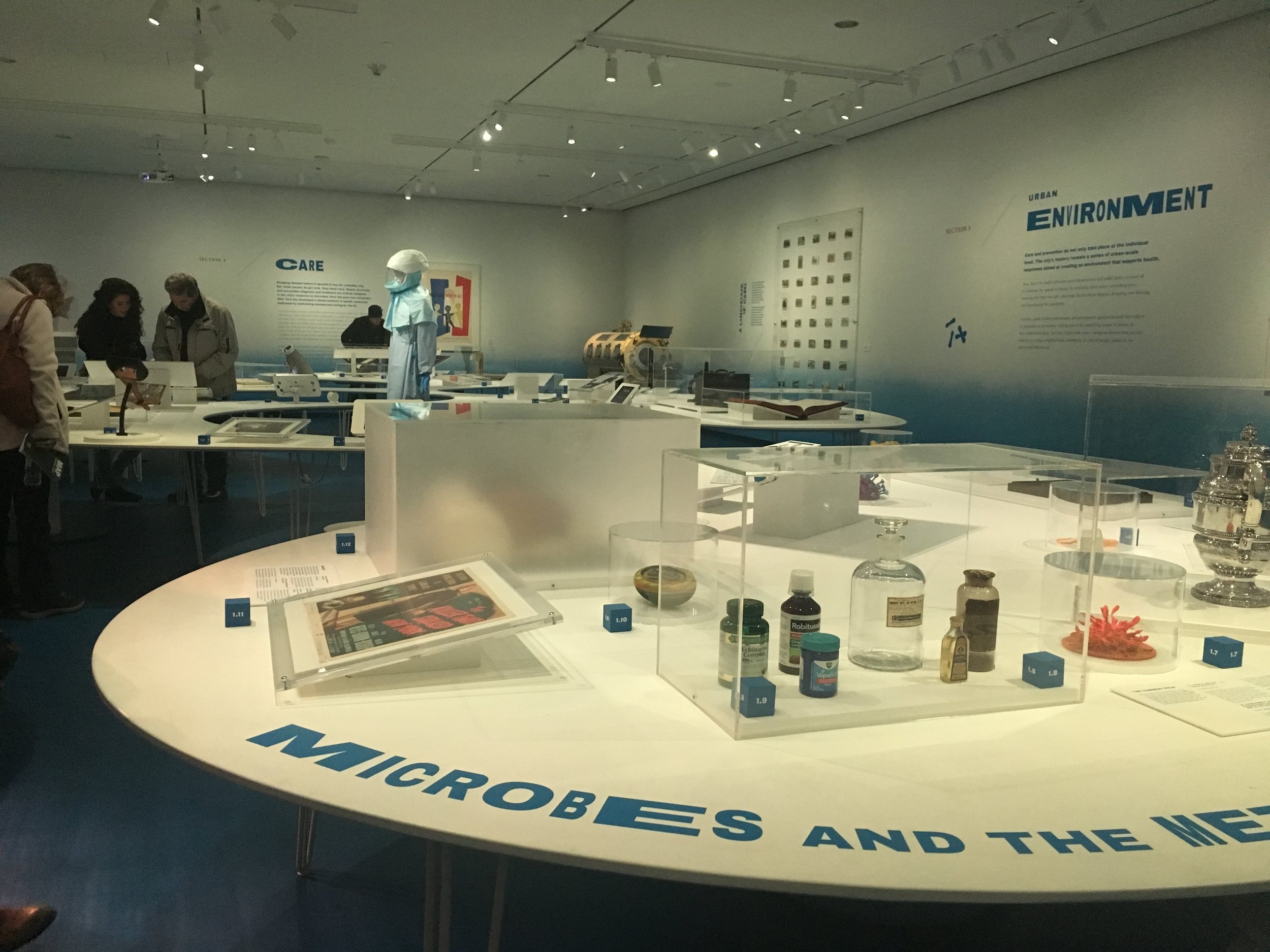
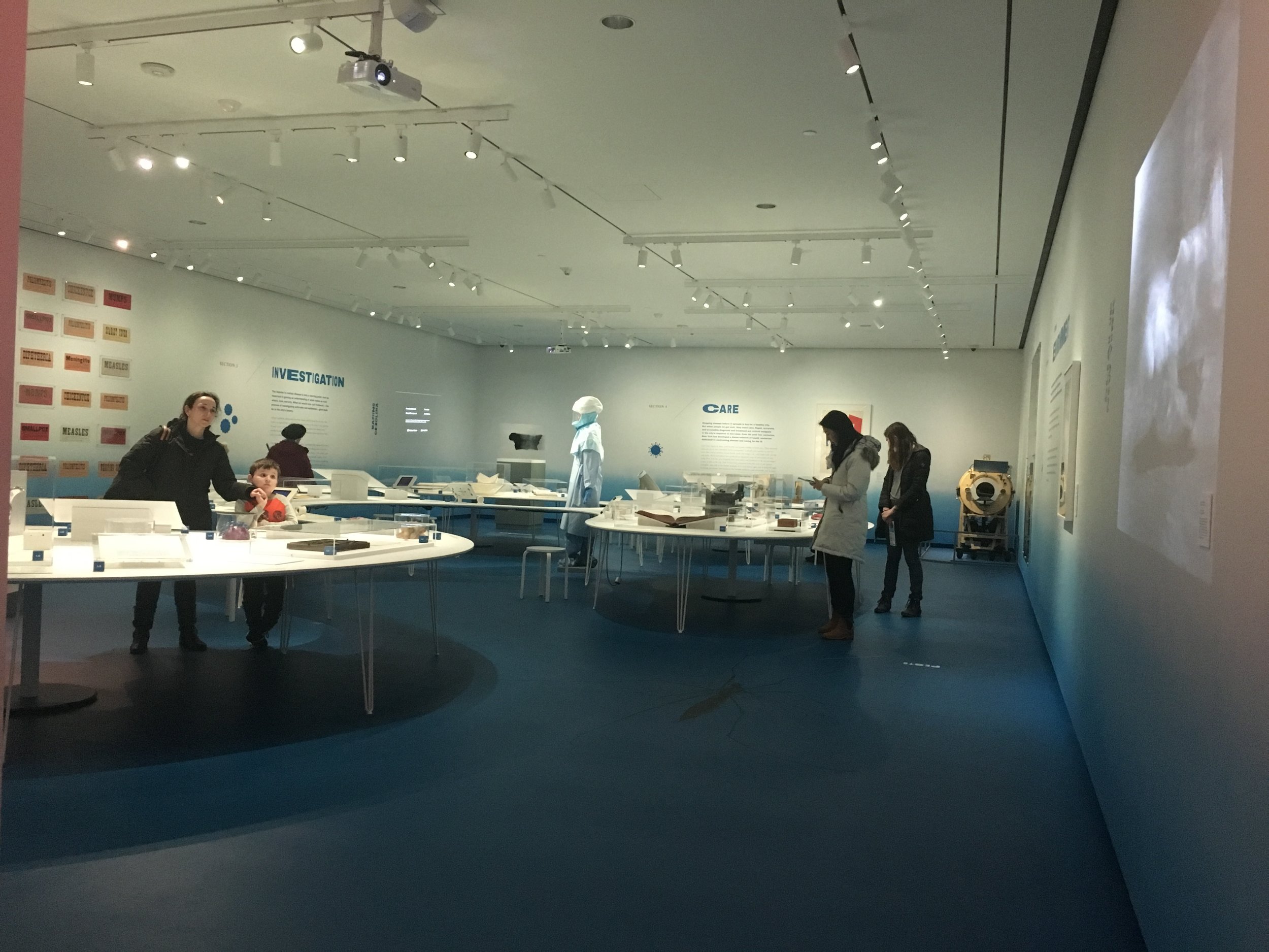
I was so excited to visit the Museum of the City of New York after hearing and seeing so much about it from one of my amazing professors. I went on a Sunday afternoon and it was not very busy at all. I was most impressed by the temporary exhibit by Isometric on germs called Germ City: Microbes and the Metropolis.
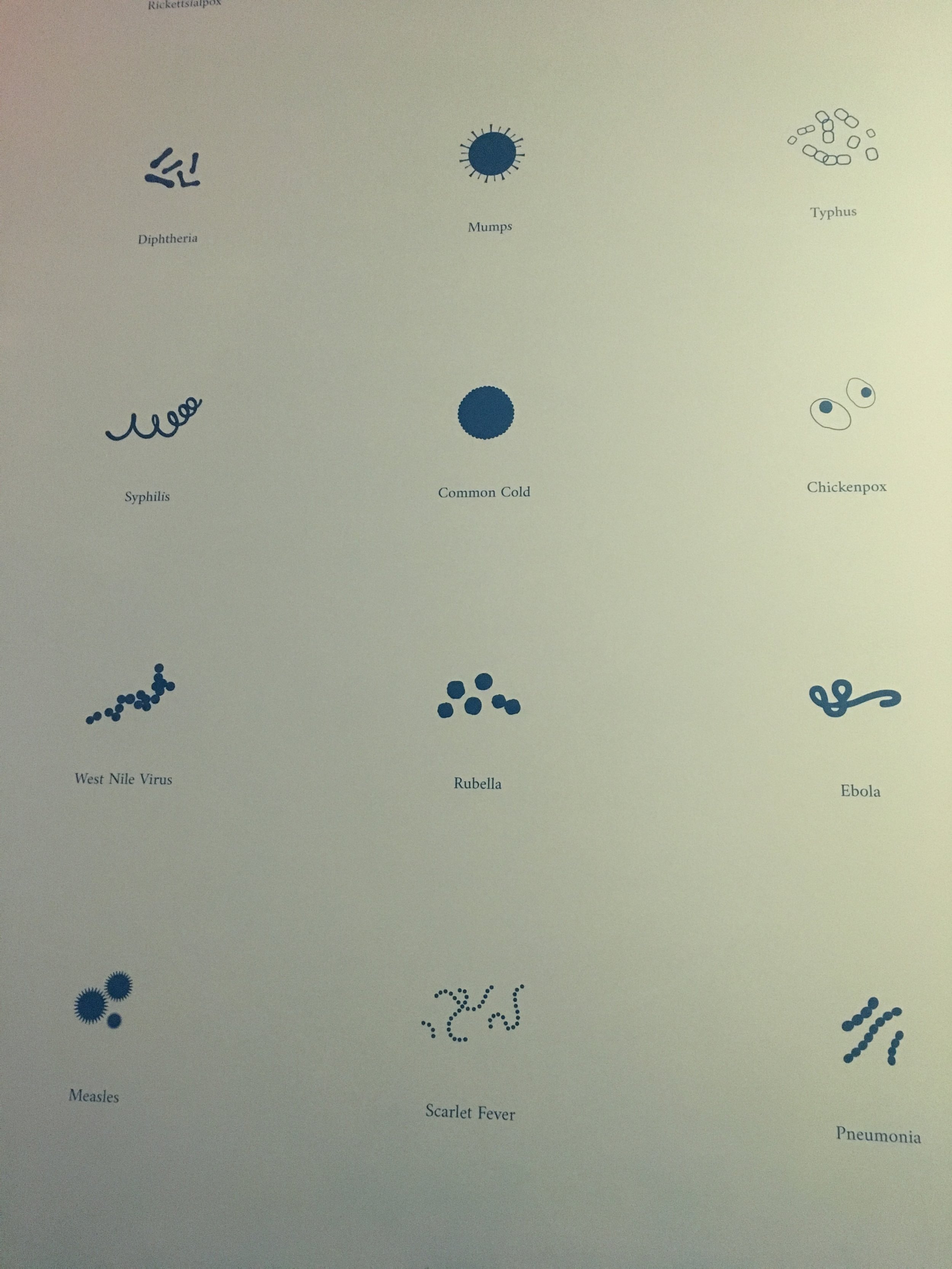
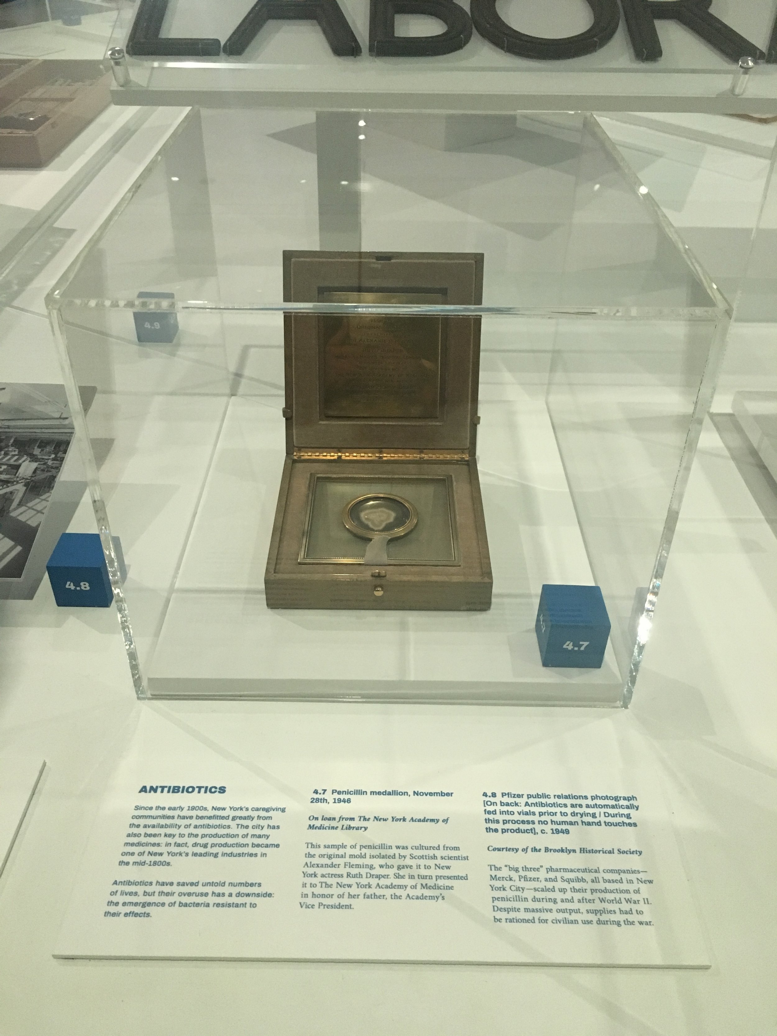
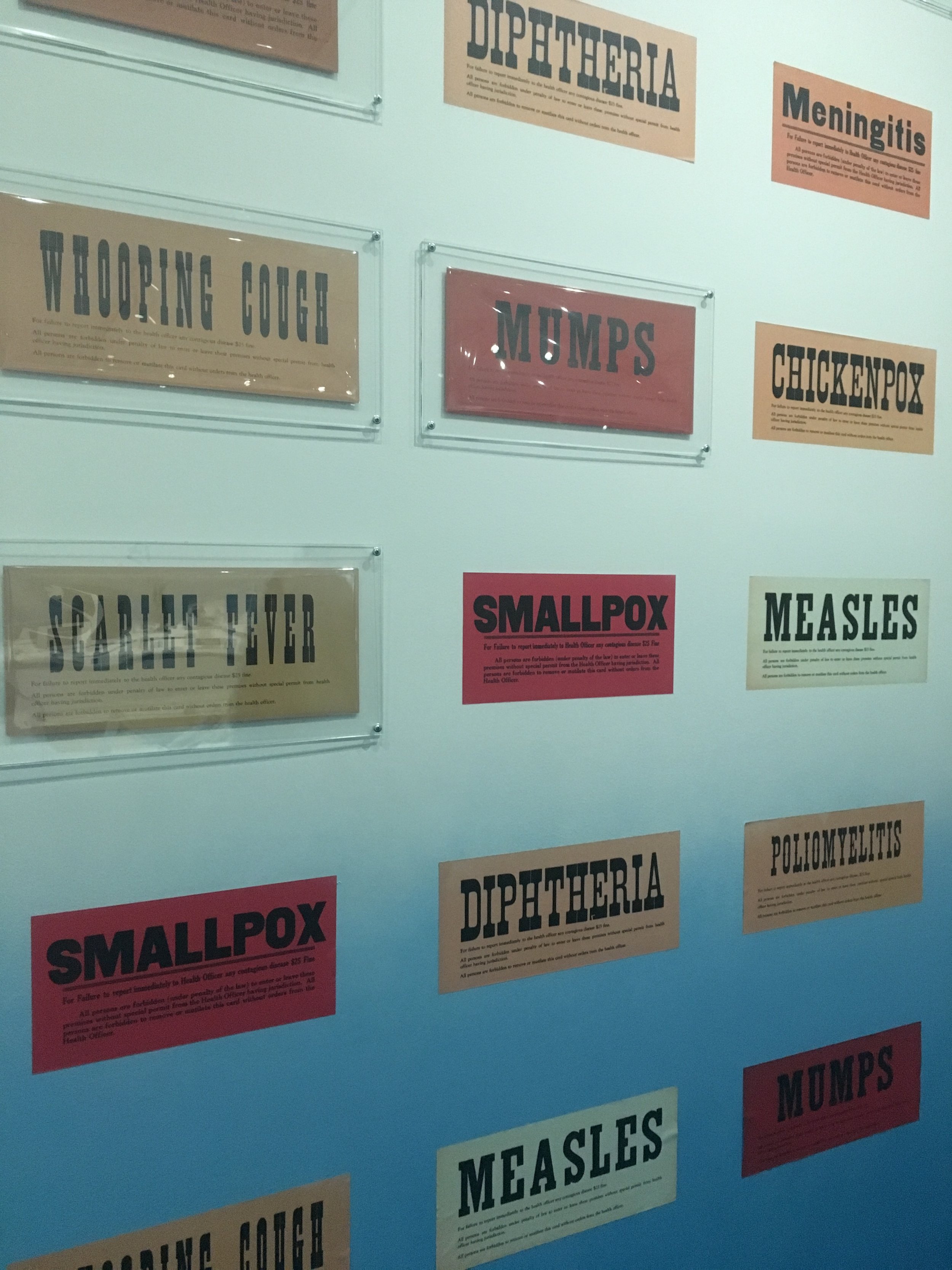
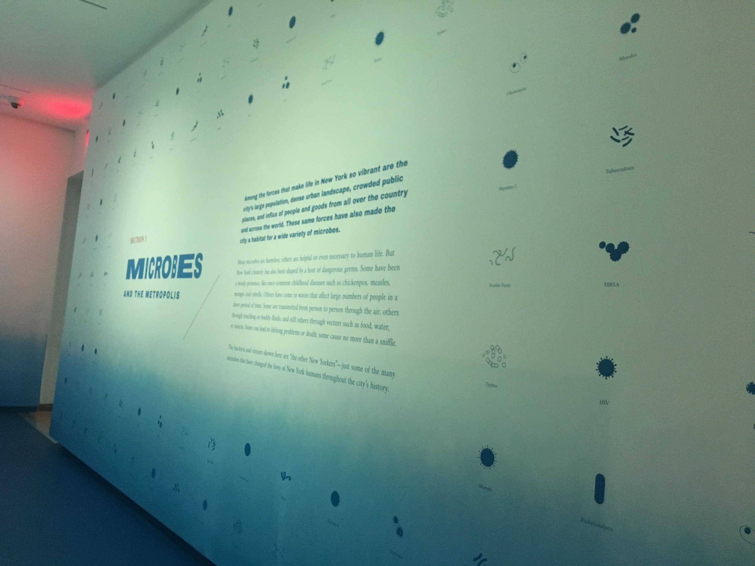
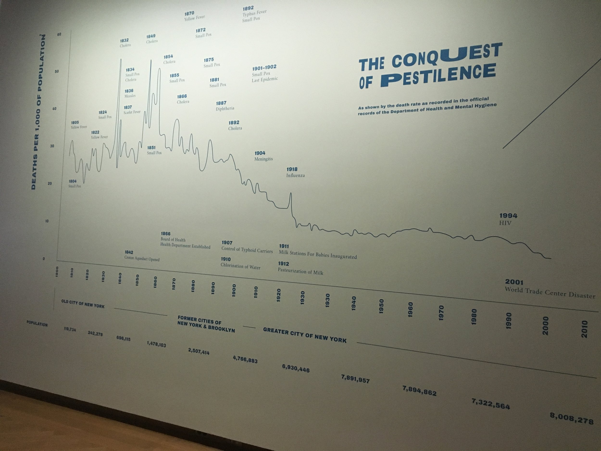
I was completely captivated by the design of the exhibit and so inspired by the use of type. This exhibit is something I have thought a lot about and referenced often in my exhibit graphics design course. The organic amoeba shape of the main artifact table and the flow around it, partnered with the type was so spot on in my opinion. I also loved the use of infographics and motion graphics in the entry space.
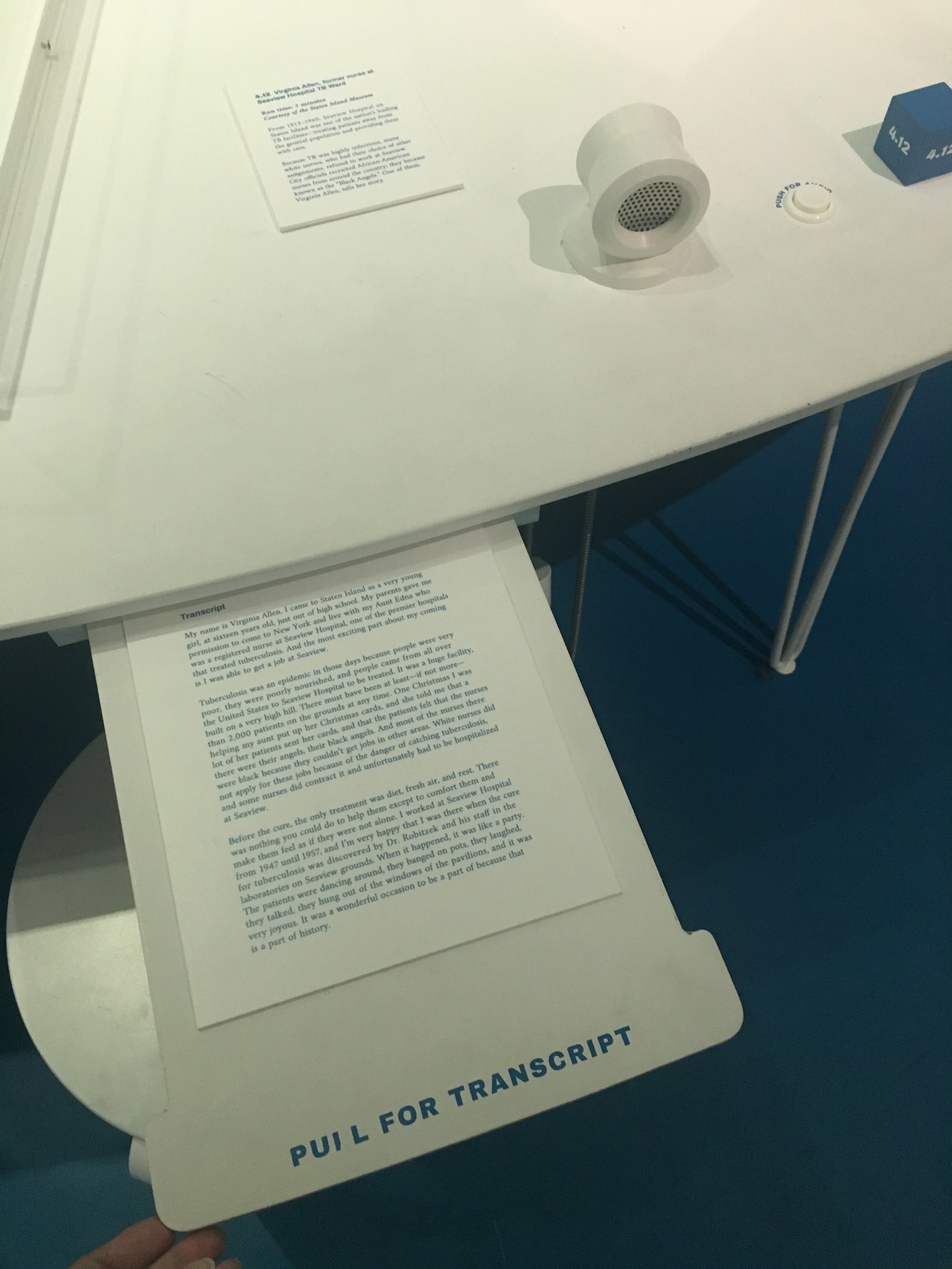
I felt the design of the space and graphics only aided in the visitors understanding of the content. I was not as excited about the way the digital aspects of the exhibit were done such as the content videos, especially since some of them were not fully functioning at the time of my visit. I would say that was the only negative part of my experience there though.

